Relaxing and speechless process video with music
Videos from my Youtube channel and random blog texts
For a couple of years now I have published videos related to making art on my Youtube channel, also titled Treehouse Art. My intention is to considerably grow the channel and link the videos here. You can watch them here (and preferably enlarge the window) or follow the link to Youtube. A huge thanks to all of you who take a moment to leave a like there—consider also subscribing!
Some of the videos are purely entertaining and follow the making of a painting, from phase to another, often sped-up and accompanied with nice music. However, there are also videos that may be useful to other artists, at least to those just starting. I'm trying to keep the subjects varied and to always include some kind of thoughts about art.
Below the videos you'll also find my very random blog posts.
How to paint detailed snow?
Oilpainting as a book cover, part 1: underpainting.
Oilpainting as a book cover, part 2: oilpainting.
Short video timelapse on detailing an eagle.
Short timelapse on making the painting Face-to-Face.
Varnishing a few paintings.
Taking reference photos in a beautiful river setting.
Turning a "bad painting" into a time challenge painting.
My Quite Random Blog
ARTICLES
There will be more coming very randomly.
ON METHODS • 5th of July 2021
How do you start a painting? From an idea—and preferably, from inspiration. Sometimes they pop up nonstop and with such high motivation that your undergoing works tend to be pushed aside. For me, this happens to a problematic degree. I may get these inspirations from plain imagination, from my own or someone else's photograph, from listening to music, watching movies or other media... If the idea arises from imagination my goal is to make some kind of pencil sketch of it, as soon as possible. Photos or screencaptures from video I place into my computer's reference folder which I've scientifically accurately organized into subfolders along the lines of "upcoming" all the way to "maybe not". There's also a folder for the finished ones.
Pretty quickly I'll also have a hunch whether the idea best suits a painting of traditional realism or something else. As I've stated elsewhere here, I don't want to shackle my expression or actually follow any kind of rules. Commissions are a differrent story and the wishes of the commissioner are all that counts.
The subject matter almost always needs to be cropped due to the dimensions of the canvas. This cropping will often occur for compositional reasons when I'm picking only part of the reference. Therefore I'm constantly making proportional calculations to finally crop the right pixel count on image editing software.
Especially with nature motifs I end up cropping the subject. A painter, very much like an author, is also a skilled liar. Not everything needs to be shown or told. At the same time, I need to carefully consider what to introduce instead if I remove something. These so-called filling elements can at worst ruin the whole.
Most often I use so-called prefab canvases but very often also MDF boards which I can purchase either separately or as part of a decorative frame. In the latter case, a quite nice frame is a bonus. Whatever the material, I always apply one or two coats of gesso which is basically a mix of glue and white paint. It lessens the uneven, vowen texture of cotton or linen canvases and gives paint a better sticking surface. The use of gesso is mandatory on MDF boards to prevent the oil mixed with oil paints from absorbing into the board's layers. If that were to happen the actual pigment (color) would not adhere properly. In the worst case, the color could start flaking off in the future.
Applying the gesso is actually the only operation in painting that I really detest. You have to be quite fast doing it because the glue starts quickly drying and becomes tacky. Reaching a smooth surface is almost impossible and—at least for me—has required many different experiments to reach a satisfactory finish. When the gesso is applied I let it dry for a few hours or overnight, then I carefully sand the whole surface with properly grainy sandpaper. I try to get rid of the grooves introduced by the gesso. In a way, some grooves and bumps are part of the handcraft nature of paintings and some painters even model the gesso to give structure to the painting.
Sometimes I base the painting with certain paint hue. The color and hue depends in that case on whether I want a bit of cold or warm to create the mood. Usually this priming is achieved with acrylic paint that is greatly diluted with water and can be left intentionally rough. Acrylic paint dries very fast and so I can start painting the actual oil painting within a couple of hours. Many times, however, there's no need for this priming.
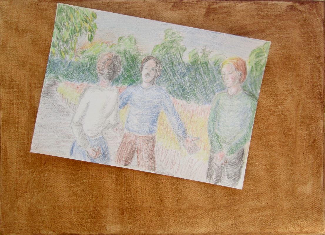
In all more accurate works (particularly the commissioned ones) I make a linedrawing as accurate as possible on pencil. Now here comes a top secret little gimmick: I often want to make sure my linedrawing has succeeded by superimposing it with my reference photo. How can this be done? Here's how. I take a photo of the linedrawing and open it with the reference photo in an image editing software (my warmest recommendation goes to Affinity Photo). I then activate the whole reference photo and copy it. Now it needs to be pasted into the line drawing where it will automatically come on top as a new layer. I need to adjust the transparency of this layer so that the linedrawing can clearly be seen through it. Next I need to match the sizes of these layers exactly—which is easy because the dimensions have already been calculated to match. If needed, I'll add some contrast to the linedrawing and play with the values until both can clearly be seen. This way it is simple to identify if there's something off in my linedrawing. I will also save this composite image and keep it open as long as I've corrected the mistakes of my drawing.
In bigger part of my paintings I have moved to a completely free approach where I won't necessarily sketch outlines at all, not even with paint. This is a reflection of my need for freedom in painting: I may often copy details very loyally, yet at the same time I want to deviate from them extremely lightly, taking no stress about it. Painting directly is, of course, quite risky and you can't always easily tell what has started to go the wrong way. If it's a portrait I may use the superimposing method quite late in the painting process. Although I'd like to approach painting more freely and trust my mental images deeper it still undeniably is a weakness for me. Painting by painting I've consciously been learning to break free from references.
From questions of approach back to purely technical side: what kind of equipment will suffice to you? I've at least noticed and understood as my experience has grown that painting is not that much about materials and equipment as I at first thought.
However, there are two areas where one shouldn't stretch the penny: canvases and paints. You find a better description on canvases and boards in my text about commissions, thus here my angle is limited to price-quality-ratio. First of all, it isn't true that only linen (for some, only the finest Belgian) is a good quality material. If you like to paint on very lightly primed canvas then the cheaper cotton canvases are no match in quality. But if you gesso the canvas at least once and appreciate a smoother surface it makes no real difference. You certainly shouldn't buy some of the cheapest market canvases since they usually are much thinner and may stretch or tear with time. Often they are also stretched unevenly which you certainly don't desire. Even the wedges used for stretching the canvas won't help if the canvas has been stapled unevenly. Also, when I buy a prefab canvas I always lay it flat on the floor to check that the frame is completely straight. With the bit more expensive canvases it is also more likely that the sides are all the same length. I've had a couple of nasty surprises in that regard as well.
With paints I've ended up using water mixable oil colors. I paint at home and under no circumstances do I want to deal with toxic fumes (solvents, cleaning media). In addition, water mixable paints can be removed from palette and brushes simply with water and soap without any hassle. Without delving into some deep material analysis it suffices to say that water mixables are as fullbred oil colors as the traditional ones. There isn't any observable difference in the end result. If you use mediums then your paintings may look a bit different for some parts than mine because I only use water to thin the paint. But there are mediums for water mixables too.
What counts more is the relative amount of oil, pigment and what is called binder. That's one area where you shouldn't try to save. In professional grade oil colors there is much more pigment than in student grade paints. In the worst cheap market packages the components haven't even properly mixed. In the beginning I bought this one cheap set and the oil came out in one continuous string when squeezing the tube. Nowadays I use these brands: Cobra Artist series, Winsor & Newton Artisan series and Georgian Water Mixable Oil series by Daler & Rowney. The latter two are considered student grade by some but I find them good. Still, the consistency and structure of Cobra is most to my liking.
How you construct your painting, there isn't any one way about that, either. I believe in intuition on this one as well. There are many who swear on the following method and I have also used it on many paintings: first make a much thinner, water diluted underpainting and start that from the darkest values. Another variation of this is to start with whatever is the farthest away in the painting (e.g., the sky) and while advancing forward, even then taking care of the darker areas first. In any case, it's called blocking in or making an underpainting. Then you let this layer dry from two to a few days after which you gradually paint in thickening layers, with increasing precision. It is usual to let the painting dry at least partially before commencing with the lightest and finest details. This, however, is actually not what is called the "Reneissance method" in which you first make a monochromatic underpainting and then glaze many layers on top of that. I'll soon make another separate article on it.
The most direct method is so called alla prima where you start with the darker areas, too, and advance toward the lightest. The difference is that you try to paint "wet-on-wet" all the time and the painting can be finished in one session. This method was made known especially by the Impressionists of the late 19th century. For the popular painting in outdoors, "en plein air", this is almost a necessity—unless you paint with very fast drying acrylics. In my portfolio there are many works made using this method and I find it a very educating way of working, especially when it comes to mixing colors and making bolder marks. Often you quite automatically choose a bit looser style using this method while you still won't have to embrace full-on impressionism.
It is surely no exaggeration to claim that at least 60% of the actual painting time is spent mixing color. When you watch videos or timelapses of painting it's usually focused on brush work and creates a completely onesided view. I use a quite plain color palette although I'm not operating on only three primary colors and white. In any case, it means that I must know the color wheel and how to mix with it. For example, there's no black in my palette and I quite rarely use green as such. Everyone has learnt at school how to make green from yellow and blue. Many artists know that you get a perfect black by mixing ultramarine blue and burnt umber and that by introducing white to it you get different shades of gray. Since pure black exists hardly anywhere in our natural environment you can get tonal variations of dark by playing with these mixes and adding appropriate colors. That's what color mixing is all about and its time consuming.
Same goes for many other color combinations and therefore painting is sometimes frustrating searching and testing. There are many tools and methods to help you match your mixed color with the reference and some even laminate their reference in order to tap a sample from their brush on top of it. I haven't taken as slavish an approach yet. When doing commissions I mostly evaluate by squinting the eye, but sometimes I place the painting very close to the monitor in good light to compare.
From time to time I won't even try to minutely replicate the tones and values, even when it comes to commissions, but instead I aim at improving them closer to what they obviously were in real life. Of course I'm not doing this with disregard or arbitrarily but in cases where, e.g., a cellphone camera has evidently overexposed areas or if there's a clear discoloration in the overall image (white balance, chromatic aberration...). In such a case I first negotiate with the commissioner and as the work progresses I check their opinion again.
When it comes to my own motifs, I've developed several "bad habits" about which many art teachers are warning but which I manage to get working in my advantage, in my opinion. These I've only learnt through experience, "trial and error". They often save some time and also prevent me from getting methodically stuck and bored. As I stated earlier, for me, painting has to feel free, not another set of rigid rules. It also underlines my goal of not being a pedantic copier of what I see but that I'm taking risks and altering things the way I want.
My perhaps most usual "bad habit" is mixing colors straight on the canvas. You're warned against this primarily because it can cause "muddy" colors where you don't want them to be. The way I usually do is to mix colors beforehand on the palette. But if I notice a missing shade on canvas, for example, in the face it's quite easy to know what color needs to be added straight in to give the right result.
This is very satisfying since it proves increasing understanding about the color wheel. It is also satisfying because it demands courage. John Singer Sargent, the master from the end of 19th century, entertained his viewers by dashing toward the canvas like a matador, tapping just the right tone in just the right spot. It must have looked miraculous but more than that it spoke about absolute understanding of colors and the use of brushes. I don't expect to ever reach that level but I like that attitude.
Depending on the aforementioned overall approach, a painting requires something from one sitting to dozens. Time management is a crucial question and patience is inevitably related to it. Especially in the final phases of a painting I often find myself struggling with this. Most of the times I'm quite enthusiastic to see the almost finished work and if this feeling mixes with the basically human desire to publish it already I'm in dangerous waters. Whether there was this only one session or as much as 20, without the finishing phase a painting won't reach its full potential. This is not the same as pedantic nit-picking. As an artist, you won't always exactly know all that's still needed—other than lighter spots and reflections here and there—but at some point you just get that feeling, it's done. It's hard to define and therefore there's a saying that an artwork is never truly finished. I don't actually mind that nagging feeling too much as I've taken a few paintings down from the wall after two months from "publication" and done alteration to varying degrees. But you'll have to draw the line somewhere.
So when is it that one mostly needs more sessions? In my own experience and from what I've heard from other artists I would say that usually this happens when your motivation starts to crackle, no matter how great the initial enthusiasm may have been for that piece. It's not necessarily that the painting has veered in a wrong direction... Sometimes a work containing alot of details may discourage you for the sheer amount of work ahead. Here experience can actually be your worst enemy: you already know how enormous work is still to come. At the same time you may get these nagging doubts that perhaps no one will eventually be interested to buy it. So why this insane struggle? Where are you going to store yet another painting? On the other hand, experience may also save because you know that feeling of satisfaction at the end and you know also how to get there. Therefore, at least for me, the ultimate reason for many sessions is not something technical (like drying layers) but more often has to do with motivation. At this very moment I have at least 10 unfinished paintings that have reached their halfway mark some 12 months ago. I'm quite confident they'll get finished. Their time just isn't yet because their author is not ready yet.
The last phase in making a painting is its protectivevarnishing. I've already written about this quite exhaustively in commission work, so here just a brief note. It has to do with protecting the painting to last far into the future but it also relates to deepening the colors. It is a fact that the colors get duller within days of finishing the painting and espeacially the shadows lose some depth. A well performed varnish really pops them out the way they were meant to be. It's a bit annoying that oil colors require at least two months to be dry enough for varnish. It is common that a painting already gets sold and hangs on the buyer's wall after which it will be taken to varnishing. The Gamvar varnish that I nowadays use dries in a couple of days and actually doesn't smell at all, so this is really not a big nuisance. If the buyer wishes to also frame the painting then this is an excellent time.
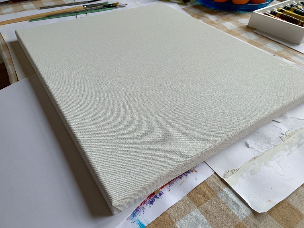
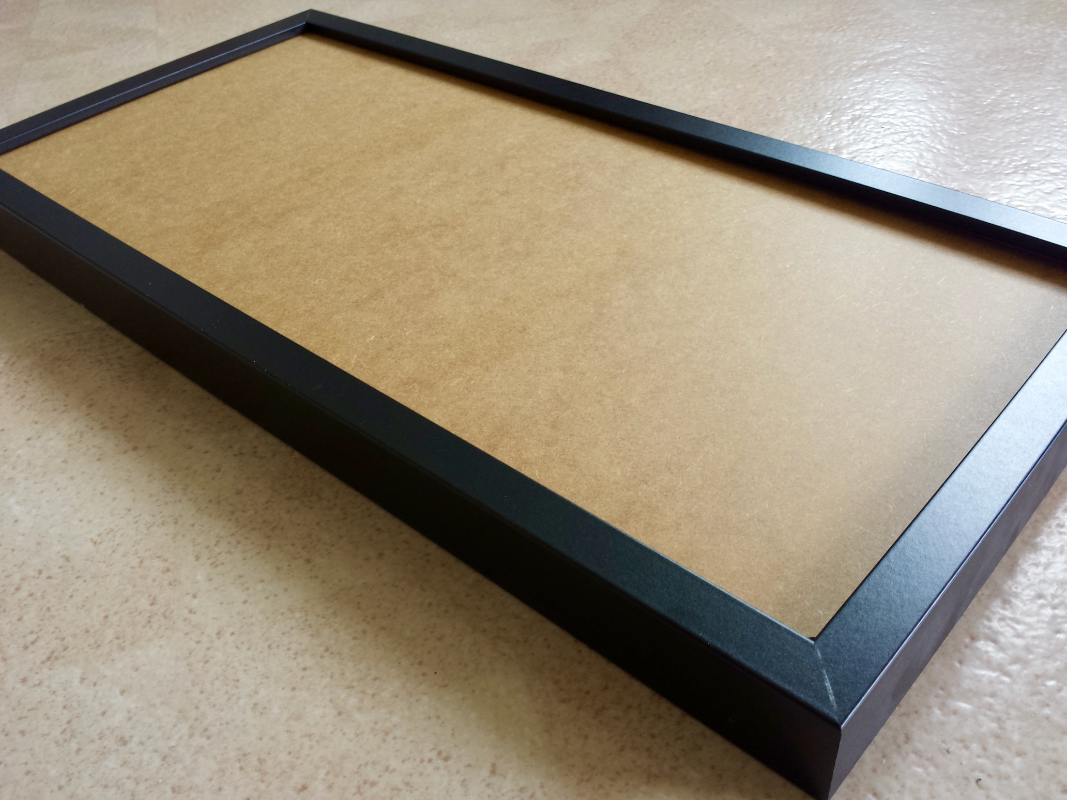
On the left, a traditional cotton based prefab canvas with its harsh patterns. On the right you can see a completely smooth MDF board which in this case is actually the back of an IKEA frame. An additional benefit of the latter is the hanger that's already a part of the frame.
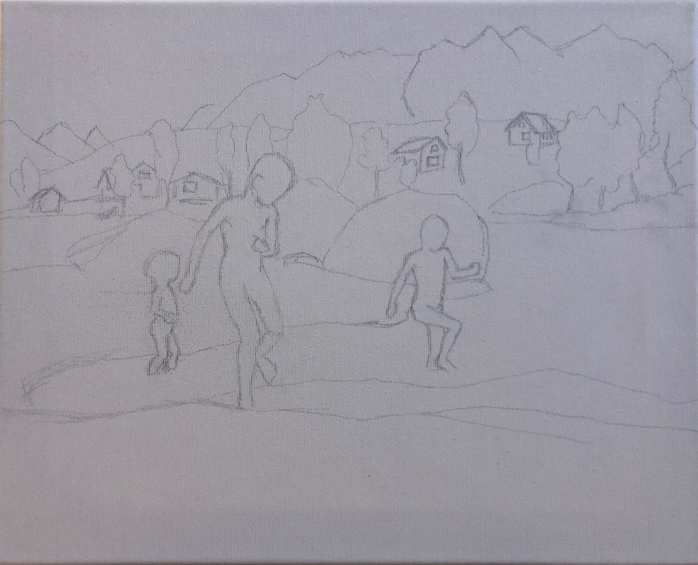
My typical first pencil sketch on canvas.
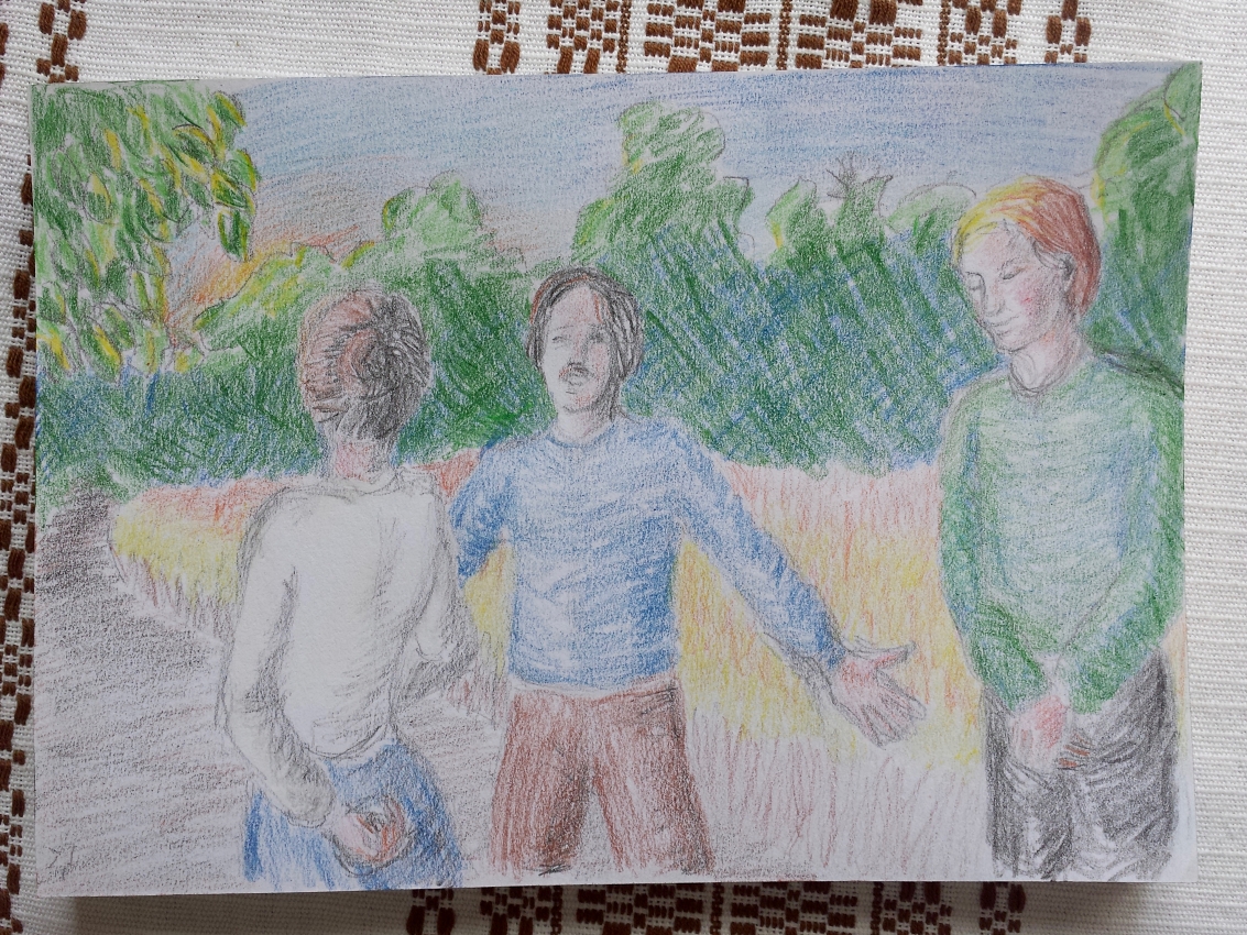
It's rare of me to do this kind of separate color sketch but sometimes it aids my ideas when I have no direct image reference.
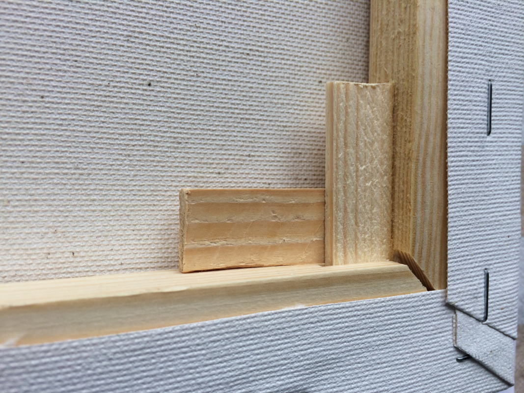
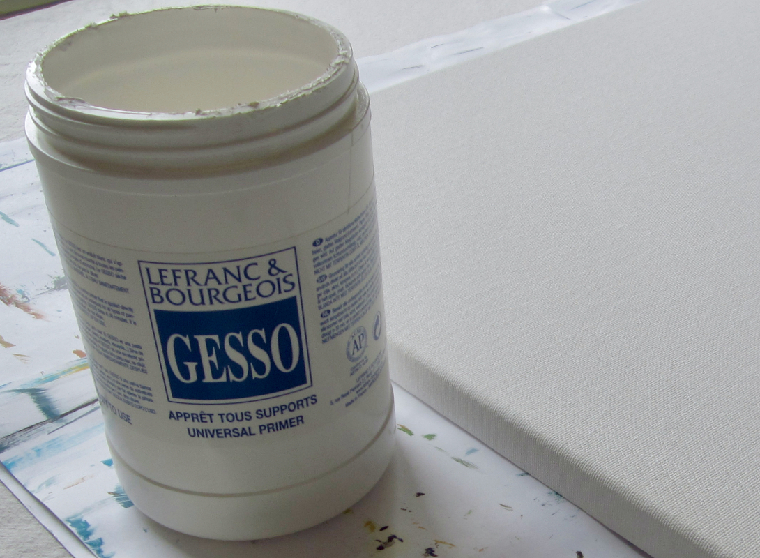
The wedges used for stretching the canvas from the backside. On the right, a bucket of gesso by one manufacturer.
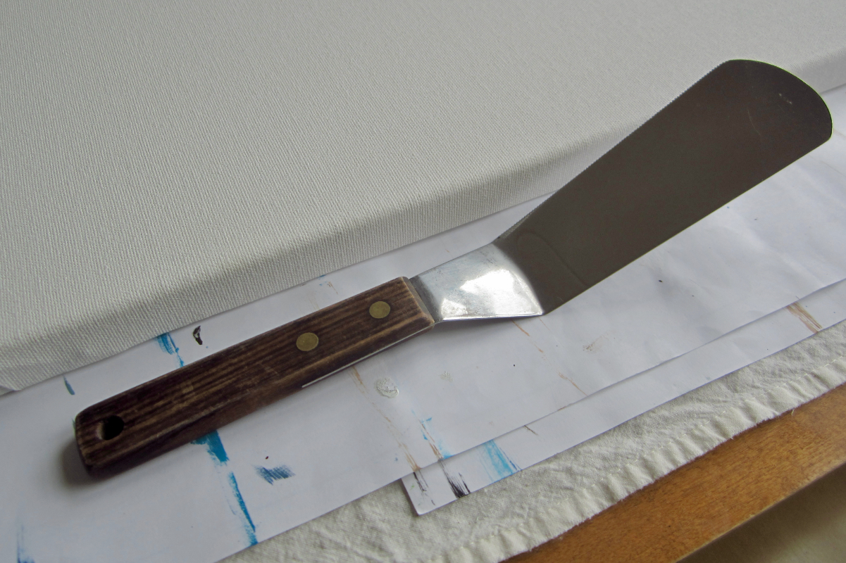
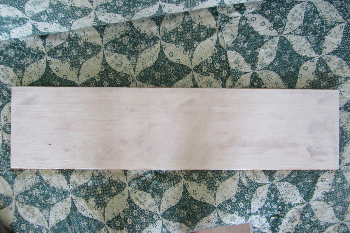
Occasionally I find myself using kitchen utensils to spread gesso more evenly. On the right, the gessoed and sanded pinewood board on which I painted Northern Lyngen from Olderdalen.
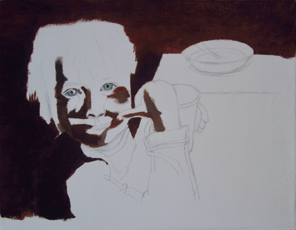
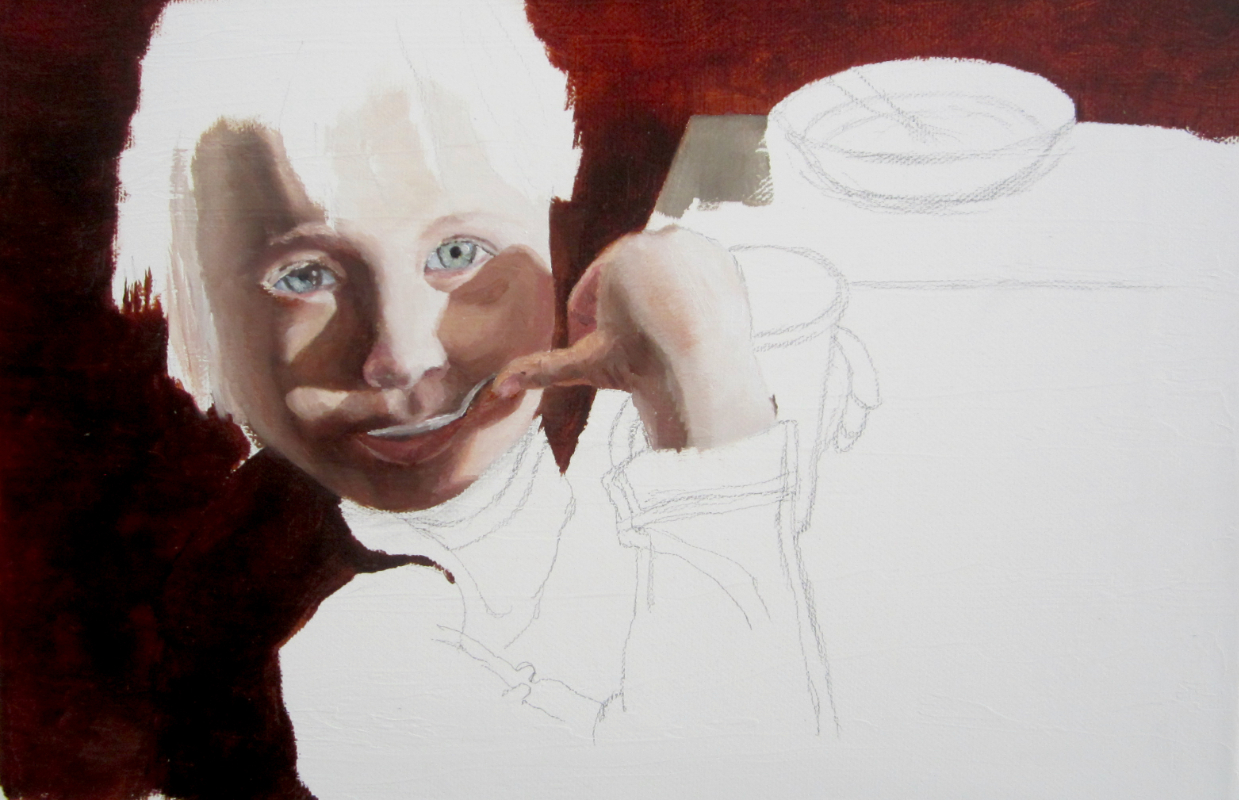
A prior sketch and undeneath that a prefab canvas which has been underpainted into warm umber tones with acrylics. On the right, a stage of that same painting after so-called block-in whereby you establish the forms and base tones.
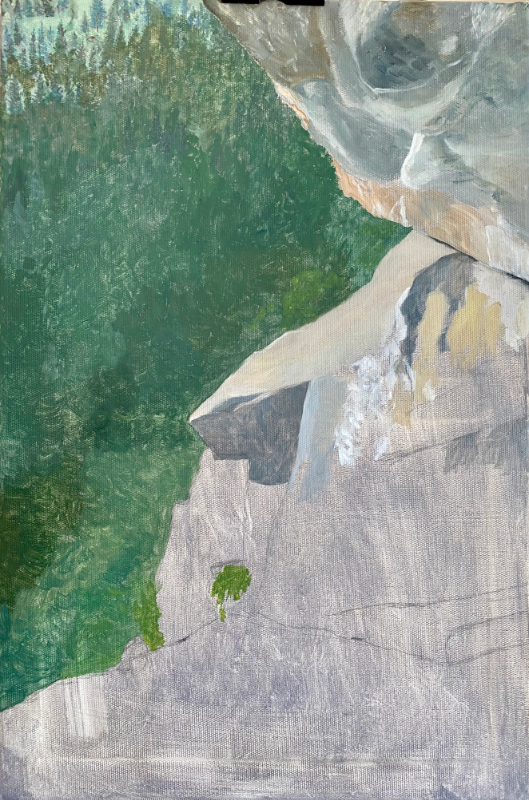
Another example of what a block-in may look like. On the other hand, the lower part of the cliff is still missing here (a commission called Yosemite Days).
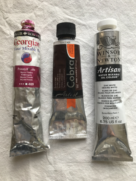
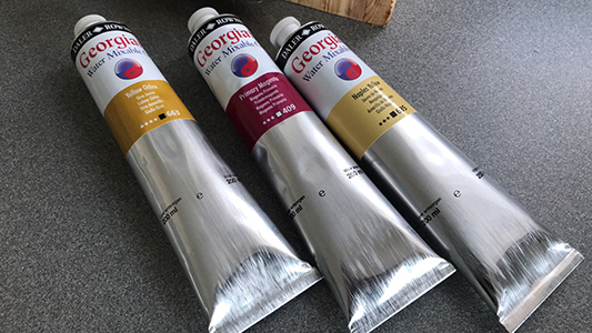
Some of the water soluble oil colors that I use nowadays.
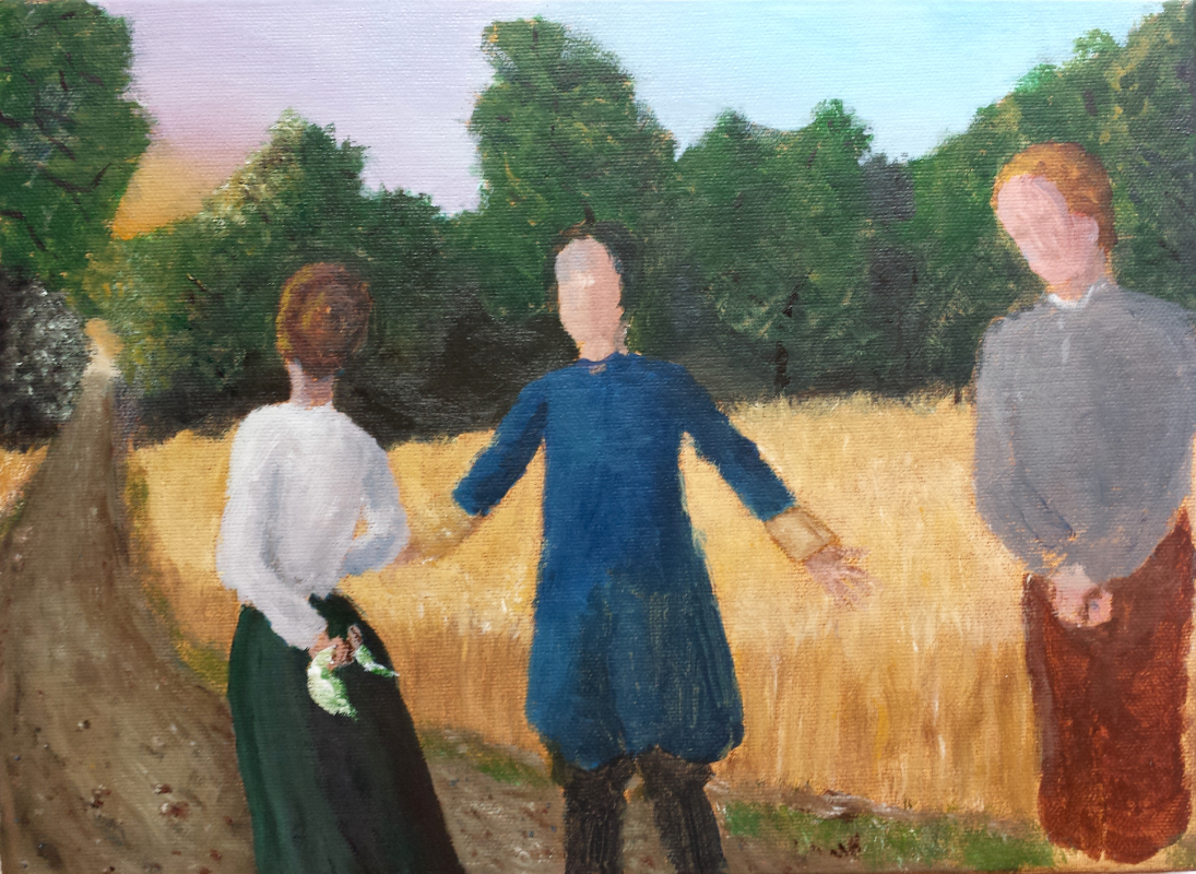
Examples of the traditional method of painting the farthest-away and darkest spots in a painting first and how to move gradually to the foreground and lighter parts.
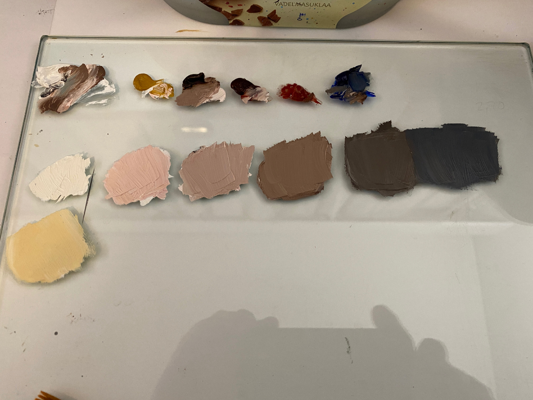
An example of mixing: different tones of the same skin, from shadows to lights, from dark to warm.
×
![]()